A fresh look for CAST

We’ve been working hard behind the scenes to create a new visual identity that truly reflects the impact of CAST, and we’re thrilled to finally unveil it!

Our journey to a new visual identity
Our new logo is but one part of the new expression of the CAST brand that has been steadily evolving since we first started in 2013.
In those early days as a “startup” nonprofit, there was much to do in our formation to get our first two pilot projects, CounterPulse and Luggage Store Gallery, launched. Designing our logo was more about checking a box so we could quickly get a website together than about deep artistic exploration.


Why The Refresh?
Last August 2022, we embarked on a seemingly “straightforward” journey to revamp our website. Famous last words…
Luckily, with the guidance of Dearborn Strategies, with the support of Flight Design Co. and Mangrove Web Development, three powerhouse women-led teams with the last two based in Oakland, we realized that to get to the heart of where we want to go in this next decade of CAST, we had to first reflect upon and evaluate our past work. We had to clarify CAST’s brand for ourselves internally before we could begin to harness our story externally.

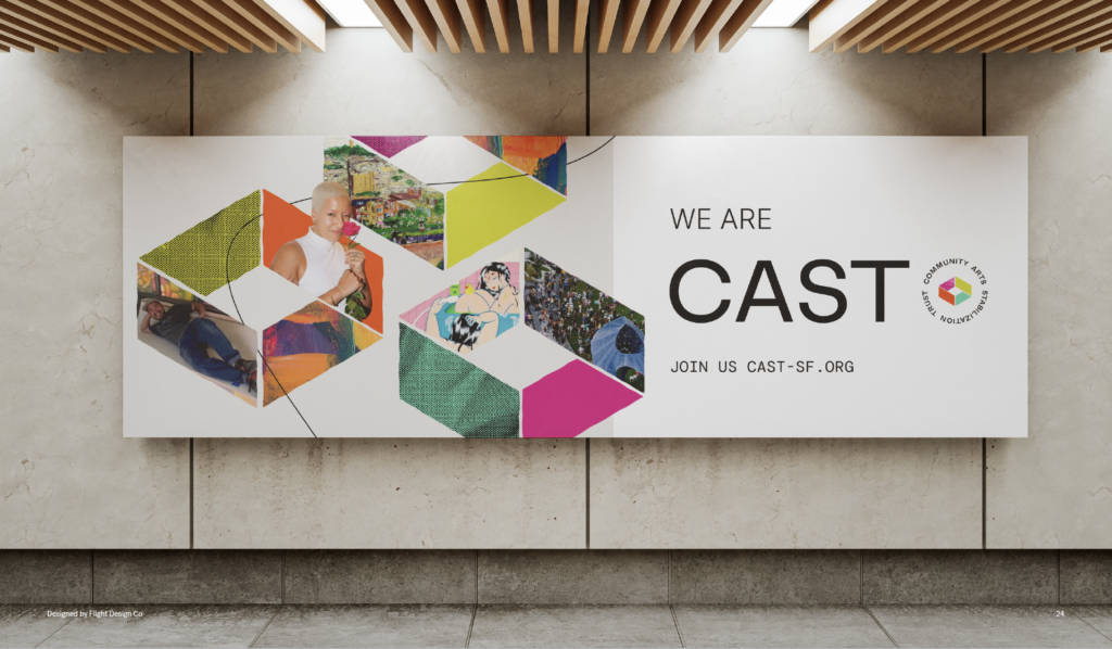
Our brand personality, visual identity, and messaging was in need of a North Star to reflect the breadth of CAST today as our work in community continues to take on new dimensions. Getting clear on that enabled us to develop this new logo that authentically captures who we are now and where we are going: a vibrant, expressive team of artists and cultural workers; and an organization whose work is innovative yet structured in creating stable affordable spaces, always adapting to center the needs of the community.
The Inspiration
In the early months of our journey in brand discovery and strategy development, we landed on four personality traits to help steer CAST’s voice, tone, and design:
- Curious
- Soulful
- Empathetic
- Pragmatic

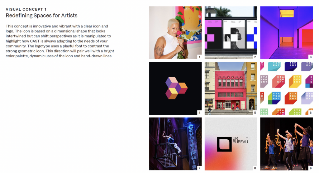
This mood board above was what ultimately led to our final logo design. The emphasis on bright, vibrant colors leaned into our soulful, artistic side and the dimensional shape of the icon offered an optical illusion of sorts, both appearing as an enclosed space and an open structure. The shifting perspectives of the icon symbolized how CAST is always adapting to the needs of the community, working closely with artists and organizations to find the best fit for reaching stability. The contrast of the strong geometric icon with the hand-drawn scribbled line and the slightly imperfect edges of the shape were important details to convey CAST’s appetite for innovation and experimental, scrappy nature.
Turning 10
Even as a crew of creatives, artists, musicians, dancers, storytellers and cultural workers, we’d struggled to find a cohesive language to describe the nuances in our work. Through stakeholder feedback, we learned just how much we relied on talking about CAST in terms of our expertise, and the confusion that ensued for our audiences when we weren’t explicit about our “why” and our “why us”.
We often call ourselves a “wrapper”, working closely with you to figure out how to best wrap a building around your programs and the people you serve. The brand strategy and messaging work helped create the “wrapper” or “container” we needed to unify our work. It built the foundation for CAST staff to find alignment and collectively draft clear, concise language that was far more understandable and something we, as a team, could all identify with.
We’re celebrating our 10th anniversary this year, and with that comes a lot of self-reflection. It had been a long time since we’d really evaluated our brand; what was created in 2013 was fine for where we were at that juncture–a newly incubated seed of an idea just taking off. Now as a team of 12, we’re asking ourselves, How can we be more impactful? How does our refreshed brand personality of “Curious”, “Soulful”, “Empathetic”, and “Pragmatic” translate into our actions on-the-ground?
Our intention behind this new brand expression is to center the extraordinary artists and cultural workers in our community and let their work show you what CAST is all about.
Make sure to stay tapped in to our socials, blog, and mailing list for more updates on our refresh and our new website launching at the end of this month.


